Rerunning Mood Checkin
Validated the revised UX of the SOS Mode feature following initial negative feedback from participants.
Study Overview
Date: June 2023
n = 6
Structured concept test followed by semi-structured hybrid interview
Testing with adolescents
First, Reuse the Approach From the First Try
First, Reuse the Approach From the First Try
Research Purpose
To validate that the Mood Checkin/SOS Mode design and UX will efficiently and effectively serve users as it’s intended. (The same as the first run)
Product Introduction
The feature being tested was a “crown jewel” of the app, working name iKinnect, that was intended to help users indicate when they need help with their acute emotional state. That could be times of great grief, depressive episodes leading to the darkest of thoughts, etc. The hope was that this app, and SOS Mode, could help regulate behavior and mental health.
As with everything, there is a lot more to this project but hopefully that’s sufficient to understand the importance of this study.
Next, Write the Protocol
Next, Write the Protocol
My goal as the moderator and designer of this study was still to validate the Mood Checkin and SOS Mode. Much of the protocol was reused from the original study, the objective of the rerun remained the same - as did the research questions. The tasks and the session did get a facelift to work with the redesigned UX of the feature(s).
This protocol allowed me to collect both validation-type quantitative data AND have space and context to ask vital qualitative-type questions.
Objectives
With designs in front of them, can users effectively navigate the feature (through prototype)?
Is this feature usable as it’s been designed for users experiencing elevated emotions?
The quality expressed here is due to a depreciation of the assets. The participants experienced a buttoned up prototype.
Research Questions
Do it work thooooo
After engaging with the feature, what does the user/participant feel it should be called?
How does the user engage with the copy for distress ratings?
After engaging with the feature, does the name feel right to the participant?
Is the feature findable through iconography on main pages?
Can the user navigate to feature through adjacent ones (crisis kit → sos mode)
What is the users' tolerance for structure of checkins and their cadence?
Then, Conduct Interviews
Then, Conduct Interviews
This time around, participants had a much easier time feeling engaged with the prototype and were significantly less confused by the feature.
As with the last set of sessions, this was a Level 2 interview which came with a specific set of steps to insure the participants’ comfort and safety. As a whole, these interviews went far, far better even when just comparing the relative confidence of the participant when answering questions about the feature.
FINDINGS & ARTIFACTS
FINDINGS & ARTIFACTS
The following is verbatim how I originally wrote it and while not particularly professional it captures the spirit of the findings very well. I presented the following to the clinical expert and the designer…
Findings
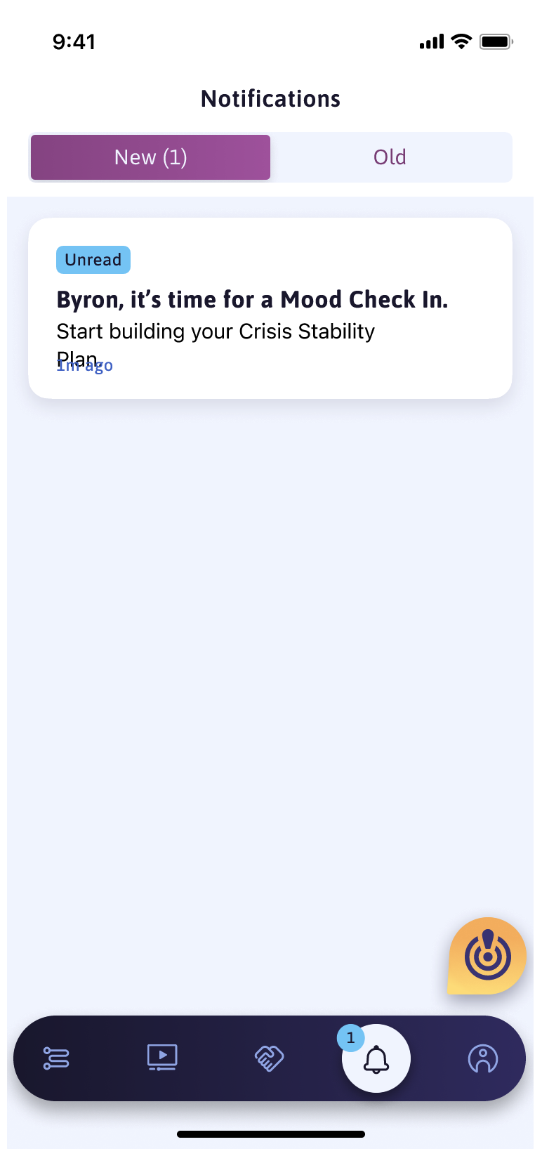
Daily notification for the Mood Checkin (needs new name) is beneficial even if the user doesn’t use it everyday, it’ll help create pattern and habit of the feature being there for them
“Easier to respond to the mood checkin than it is to voluntarily go find the crisis mode.” Door metaphor from 1075
Users do believe that this is something that they would use after enough time having the app
Just knowing that they have somewhere to go to get help/support and to see their plan in front of them instead of having to remember
Called out as being particularly helpful to folks who are early in recovery
Updated experienced “a lot easier” and clearer for returning users from 1st run
Recommendations
Consider in future iterations a path for users to opt into adding more information about their mood
“Helps to stop and understand the emotions first before trying to help with crisis kit. Early recovery has a lot understanding of emotions and unpacking the mood to understand what the cause of it is”
Needs a new name
“SOS Mode” is not an SOS mode - it’s just a mood checkin
Mood “Checkin” might indicate a look at the emotions/moods of the moment. Users expected to be asked more about how they were feeling and why when thinking of it as a “Mood Checkin”
A true SOS Mode could still be split out - where the user does not need to say how they’re feeling but instead instantly see content and contacts to help them through negative emotion surge
We could also just strip the nomenclature and land on a feature name that covers all use cases (seems possible lol)
Mixing Mood Checkin & SOS Mode & Crisis Mode & Crisis Kit does not serve user nor their understanding of the purpose of the feature
Names matter?? WOaAH
Some naming guidance
“Daily something will help affirm usage” and a reason some folks feel bad is physical, not just emotional. Mood can be caused by external variables.
Keep user in the experience if they report negative emotions in followup (after first checkin), don’t just drop them out with a bland message about “hope we helped”
“would feel abandoned and neglected if the mood checkin experience ends even if they’re feeling bad still after using their crisis kit”
If the user reports negative emotions in the first experience, warmth and validation from the app would go far in creating user trust. It makes the feature feel like it’s actually listening to the user and “understands” that they are not good at that moment. makes it feel more real which would encourage use
